

Google.
Synonymous with "looking up something on the Internet", and thus, accessing information. Pretty amazing to have developed something so powerful (the magic is in it's simplicity) that is has been one of the drivers, dare I say leaders, of the democratization of information. Brain food/recipes/porn/news/trivia/perez for all.
The Google issue of discussion today is... their logo. I re-created the above using the font "Adobe Caslon Pro", but there are subtle and not so subtle differences. For one thing, I see now that the "g" is completely off. Compare for yourself. Comparable, however, to their original logo when they were still operating in beta.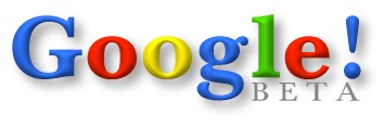
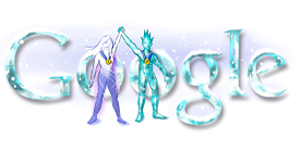
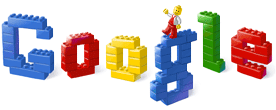
But of real interest are their sometimes inspired and other times confusing themed logos - most recently, the troubling homage to Earth Day. That one, and some other abhorrences and faves over the years, are below:
The Bad:


The Good:


Reminisce on these and others, compliments of Google.
Friday, May 2, 2008
G is for...
Subscribe to:
Post Comments (Atom)

No comments:
Post a Comment